


LIVING CORAL. MORE THAN JUST A DREAM.
Pantone announced their colour of the year as coral. A bright and beautiful shade that hints at a sense of hopefulness. Hear our thoughts on coral here.
On Pantone’s colour of the year.
(3 minute read)
According to the Pantone Institute the new trend colour of the year is Living Coral. Annually, the decision results from a trend analysis in fashion, design, social media and other fields. But, there is also something very special about this years tone, which made us fall in love with it long before the official announcement.
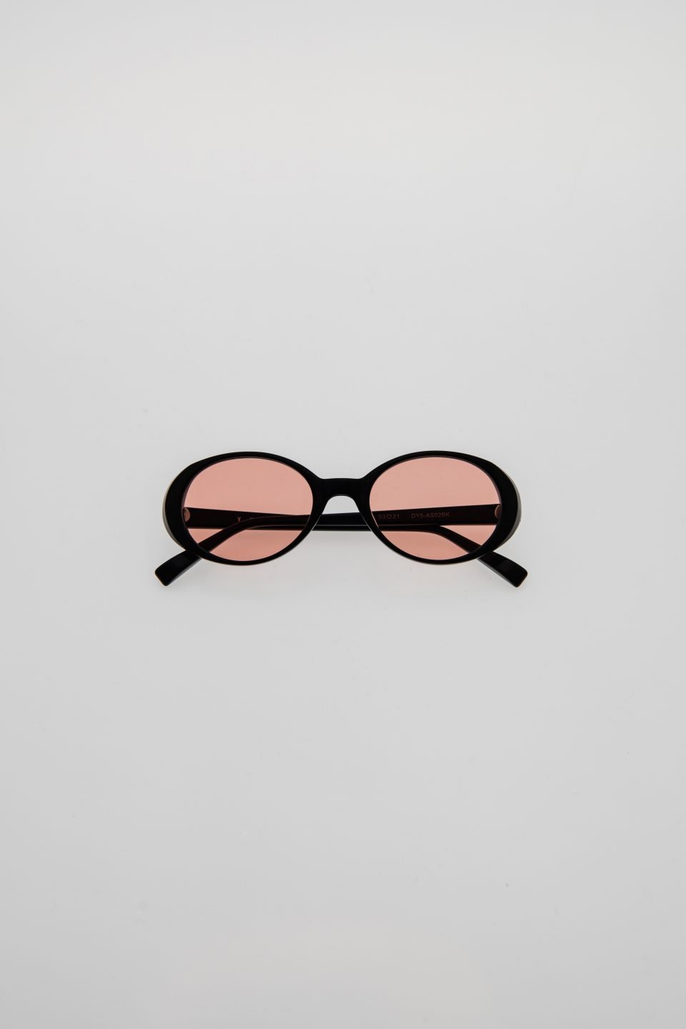
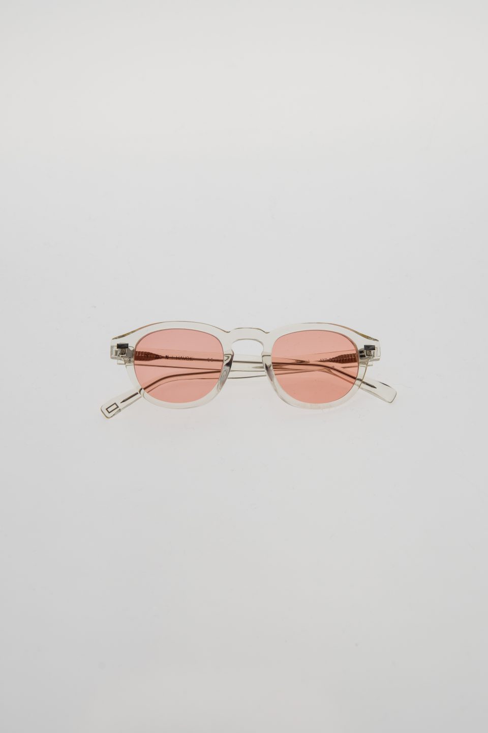
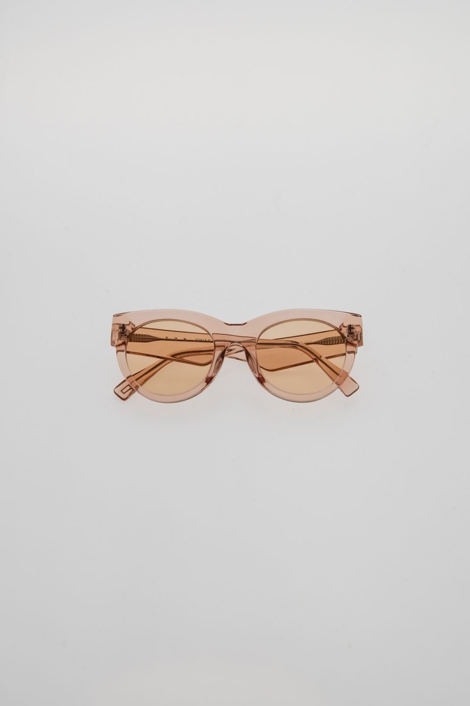
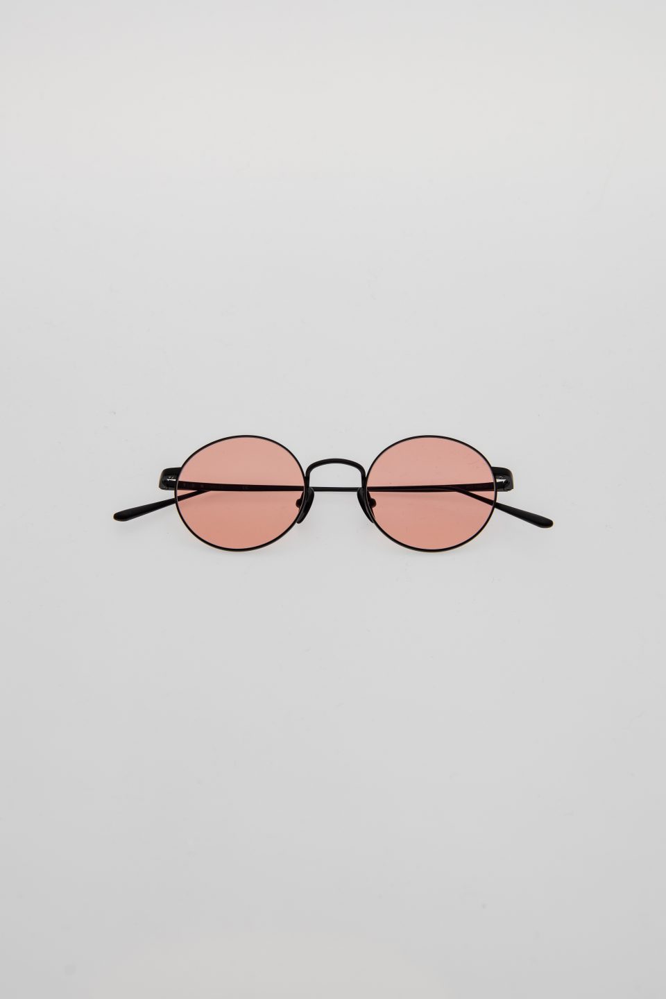
“An animating and life-affirming coral hue with a golden undertone that energizes and enlivens with a softer edge“. The Pantone Colour Institute has announced its trend colour for 2019. Living Coral, also called PANTONE 16-1546, is a vibrant, yet mellow tone, which not only reminds of the mesmerizing colours of the underwater world, it also promises to offer some idyllic warmth within the cold winter months and welcome spring with a lovely hug. In other words: a colour to dream, a colour to shine.
A mixture of Red, Orange and Pink
This becomes even more obvious when having a closer look on the colour spectrum itself. Coral as a mixture of red, orange and pink combines the three warmest colours. But even more interesting are the different characteristics that come together: While red is meant to be a strong colour, full of energy, the colour of monarchs and sometimes even considered a little aggressive, orange mostly stands for happiness, joy and youth. Pink is the softest one of these three. In history, it had been considered the colour of princes and little kings. Later it became related to so called female attributes such as softness, positivity and calmness. But no matter which gender we have: when we fall in love or when we feel really good, we see the world through rose-tinted glasses.
Maybe this is also why, according to the Pantone experts, the choice of Coral is a reaction to the onslaught of digital technology and social media increasingly embedding into daily life. “We are seeking authentic and immersive experiences that enable connection and intimacy. Sociable and spirited, the engaging nature of PANTONE 16-1546 Living Coral welcomes and encourages light-hearted activity,” they say.
Is Coral the ideal fusion of modern life, the colour that brings the digital sphere and real life together? We think our fascination for the tone is much older and closely linked to our early childhood.
Dreaming of a life under the Sea
The tale of ‘The Little Mermaid’ has been told to kids for ages, so has been the legend of the sunken city Atlantis. These stories were full of adventures, of joy and sometimes of love. They opened up a world far beyond our life on land – a world that seemed to be so alternating, so rich of colour. Who didn’t try to hold one’s breath as long as possible, when taking a bath? Because, if we maybe just tried hard enough, we might be able one day to go there once and experience everything we read about with so much fascination. But the older we grew, the more we realized that our abilities were just limited and the life under water unfortunately had to stay a dream.
Well, perhaps not for all of us? Some of us have kept their dream. These people invest all their imagination and genius to bring the underwater world closer to us by enabling us to wander through immerse aquariums or to swim like a mermaid with a flipper strapped over our legs. But most importantly, many of these dreamers have dedicated their lives to a much bigger goal: saving the beauty and the richness of the underwater world. The pantone experts summarize: “Lying at the centre of our naturally vivid and chromatic ecosystem, PANTONE Living Coral is evocative of how coral reefs provide shelter to a diverse kaleidoscope of colour“. These reefs are more and more in danger and we have to do everything possible to save them and the planet earth.
So, with the words of the Pantone experts, let’s treat Living Coral not just as a lovely trend, but as a symbolization of our innate need for optimism and joyful pursuits. As a colour that engages us and brings us together in harmony. At a time, the world appears to be merely divided, it can need a little dreaming of a better world – where diversity is a chance rather than something to fear.


 According to the Pantone Institute the new trend colour of the year is Living Coral. Annually, the decision results from a trend analysis in fashion, design, social media and other fields. But, there is also something very special about this years tone, which made us fall […])